It’s one thing to color a children’s farm book where the barn is just red, the grass is just green, the sky is just blue, and the colors are just as flat as a cruise through Kansas is. However, to pop your pictures with visual depth and colorful movement, it’s going to take more than red, blue, and green to get through the page.
Adult coloring tips for coloring and sharing are sharpening your pencil and using different sides of your pencil tip, the three-tone rule, creating swatches, layer lightly, burnishing the ends, shading around object edges, adding darker color tones, employing neutral shading with black, consider the light source, implementing color pallets and texture contrast.
Below are twelve tips and tricks for shading and detail work to bring more delicious ink to the page. These tips are in a general start-to-finish order, but not rigorously so.
Sharpen Your Pencil and Use Different Side of the Pencil Tip
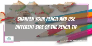
Coloring with dull pencils results in a dull picture. There’s no excuse for lacking the leverage and precision you need to be your best. Do yourself a favor and keep that pencil in good shape. It’ll be useful when executing hatching, cross-hatching, layering, and creating textures later on down the road.
Additionally, by using the side of the pencil tip and rotating the pencil as you color lighter layers, you’ll be able to passively keep your pencil sharp as opposed to needing to stop and actively sharpen the pencil as often. Artists such as Bobby Chiu, a specialist in creature and character design, heavily use the broad side of their pencils to create a litany of textures as well. Whether you’re coloring creatures or mandalas, maintaining a sharp point on your pencil is a vital key to success for stepping up your art.
The Three-Tone Rule
If you’ve been here before, then you’ve heard me talk about the Three-Tone Rule. And if you haven’t heard of it, in short, the three-tone rule is for every one base color you have, such as blue or yellow, you must also have a lighter tone and darker tone color for each base color such as light blue and dark blue, or light yellow and dark yellow, for blue and yellow accordingly.
What the three-tone rule does is provide color depth. By working the flavors of different tones in color together, the picture achieves a smooth and rich pallet of texture in terms of visual depth and vibrant colors with more overall color spread into the page. Most importantly, the three-tone rule like having a sharp pencil is a base for setting later art tips up for success with ease.
Swatch Your Colors
Another vital and key step for coloring is swatching your colors. Swatching means coloring an area on a scratch piece of the same type of paper your picture is on. It’s a test pad for your colors before committing them to the actual picture. You can swatch all the colors you have or just the colors you intend to use. I swatch the colors I will be using, sometimes concurrently with coloring my picture.
Additionally, I also like to swatch possible textures, line techniques, blends, and/or gradients that I might use in my picture as well. It’s not uncommon to see art swatch large circles of color that include dots, hatching, cross-hatching, three-tone gradients, warm blends, cool blends, and just about anything you can think of. The point is, go wild, the swatch is your laboratory, and unlike a nuclear fission lab, you can make mistakes. Messing with your swatches is encouraged! Get creative because you may find something you like by accident. Serendipity.
Layer Lightly, Burnish The Ends
When it comes to putting color on the page, there’s a pretty universal technique… color lightly. It’s up to you if you want to do ovals or zig-zag, and different blends or textures may require one over the other, but either way… color lightly.
First of all, it saves the life of your pencil. Art supplies aren’t always cheap, especially the good ones. Second, a light layer of pigment doesn’t kill the tooth of the paper. If you don’t have good paper, go get some—the closest thing you can to a card-stock-like thickness. If you’re using dry mediums like colored pencils, get a matte finish. If you’re using wet mediums like markers, get a slightly glossy finish. In both cases, colored pencils or markers… color lightly. The bad paper will have a flat tooth that cannot hold onto pigment very well. That’s why colorists use thicker paper with specific finishes. However, even good paper with hungry teeth has its limits. So by coloring lightly, we save the tooth of our paper and allow more layers of color to be put down further on.
The advantages of lightly layering color are to achieve more complex color tones, create gradients, and access texture options. Even if it’s the same color layered over itself multiple times, the color will come out bolder with more visual depth as opposed to just coloring with a lot of pressure.
Shade Around Object Edges
The best way to get started on shading and shadowing practice is to darken the edges around each object on the page. There are a couple of options colorists can use to shade edge areas, and all of them are worth practicing.
The first is to use the three-tone rule and color the darkest tone of each color surrounding the edge lines. Then by blending the darker colors into the medium tones and eventually light tones of the color as the eye moves away from the edge lines, the picture will have instantly more depth and subtle than if we had just used pressure with a single color or a flat color mixed with black.
The next two are line-based and can be used in conjunction with the three-tone rule shading. By using hatching, a series of parallel lines in close to fine proximity to each other, colorists can create shadows while still preserving the natural color of the layers below. Using hatching, or cross-hatching — achieved by crossing all the parallel lines with individual perpendicular lines — allows artists to create more contrast by quickly switching from a dark hatch or cross-hatch to the color base below as opposed to a pure gradient approach.
Use all three at once if you want; no one says you can’t. There’s a lot of color depth to be explored by mixing dark-tone color gradients under hatching and cross-hatching line shadows. Get creative, make mistakes.
Add Darker Color Tones, Not Just Black
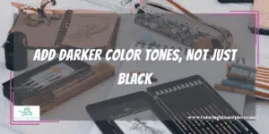
Part of the reason why the three-tone rule is so popular is that it naturally shifts the color. When colorists immediately mix black color pencils into the color equation, often they’re left with an inky-looking smudged mess. There’s nothing wrong with adding black to a shading gradient, and it is often necessary. However, it’s important to note that no matter how much contrast or heavy of a shadow an artist might be going for, there needs to be a gradient border of dark tones to black shadow in most cases.
Create Gradients
When it comes to creating gradients, start with your mid-tone and work the lighter end of the spectrum first. Darkening a color is easy enough, but reversing the process isn’t as easily accessible. Feel free to color as lightly as possible with your lightest tones nearly to the point of the paper being completely white. By gauging the lightest tones first, it’s a lot easier to set up all the darker tone options.
Each gradient starts with the lightest tone available. If white is the lightest tone, then feel free to leave a little bit of white paper showing. Color the whole area with the lightest tone and layer lightly; all the other colors will go over this base, so we need to preserve the tooth of the paper. Next, color the medium tones over approximately one-third of the light-tone area. Next, follow that process, color each darker tone over the previous layer of color in approximately one-third increments each time until you get to your darkest color. It may take a little finagling and some practice; each person executes the details of a gradient a little differently, but the results should be the same—a lighter to darker tonality in one color base.
Employ Neutral Tones
Darker tones have a lot more character to them than just adding black and blends. Colors like yellow, orange, and some greens can be toned down to neutral colors such as darker browns offering the picture more diversity and depth in the dark tones and shadows. Colors such as blue, purple, and some greens can be toned down to dark grey colors for cooler options.
Shading With Black
When it comes to shading with black, feel free to not go ham. Unlike your swatches, getting serendipitous with the black pencils can quickly turn into a smudgy mess of inky pigment. The best way to get some black into the picture without overdoing it is to soften the dark pigment with some friends. By using the black color in areas that are already dark, the heavy pigment will naturally add depth without losing out of place or being too heavy. Black color is also excellent when trying hatching and cross-hatching to create shadows over darker layers of color.
Consider The Light Source
Shading the edges is a great way to get off the ground. However, there is a next level for when you’re ready. If you aren’t familiar with hyper-realistic art styles like that of artists Maria Teicher or Mike Dargas (@mariateicher and @mikedargas on Instagram), then please take a deep inspirational dive. One of the ways artists can achieve realism is by shading according to the light source in the picture.
For instance, if we color an apple on the table with the light coming from the top left corner, Then the shadows should be longer towards the right corner behind the light cast of the object. The coloring is the same as before; what changes are the angle and, with it, a whole new set of logic problems. The best way to start coloring with a light source is to critically analyze light sources in the real world and other artist’s work. This technique takes a lot of practice and time to develop your style of light source-based shading practice.
Check out more blending tips HERE.
Implementing Color Pallets
It’s always a pleasure to go with what the eye wants, but often we can get trapped in our preferences simply by using the same colors over and over again. Expand your brain and your coloring pages by trying various color pallets. There are plenty of free color pallet generators online, such as Colors. Co, Canva.com, or Colormind.io.
Color pallets are an excellent guide to getting the creativity going; after all, it is still up to the colorist to decide how much of each color in the pallet to use as well as where and when. Color palettes don’t do the work for you, but they do set you on a journey to navigate. By finding the closest colors you have to each color in the pallet and then breaking down each color into the three appropriate tones, you’ve got plenty of pigment to get going.
Texture Gradients
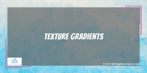
Lastly, for these tips and tricks, the info pump is textures and texture gradients. Creating textures is more about how you physically color as opposed to what colors you use. By using the pencil or marker to dot the page or streak sharp lines across the page, the picture takes on a more visually physical quality. In the case of physical visuals, spacing becomes extremely important.
Artists can manipulate the space in conjunction with percussive pencil marker marks to create a physical gradient. For instance, coloring dots over a base layer of color and starting with lots of space between each dot allows for a breathable texture. If the dots then gradually become closer and closer as we view the picture, eventually coming to the point of concentration, the physical gradient created helps bring textual depth as we view the picture.
Textual gradients can be used over color gradients and shaded areas for some interesting combinations. However, just like light source-based shading, this takes lots of practice, lots of time, and lots of mistakes to develop your style. So be patient with yourself; you’ll get there.
Frequently Asked Questions
Are My Art Supplies Holding Me Back?
In general, it’s always best to improve the use before the tool. It’s a great way to save some money in the short term. However, there are times when cheaper elementary-level supplies can be the downfall of practicing technique simply because the materials aren’t able to produce better quality no matter how good you are. If you’re finding that your gradients and layers are flat in color value, and your art supplies aren’t able to produce textures despite all the manipulation you can muster, then it might be time to move on.
How Much Practice Does It Take?
Everyone learns at their own pace; however, just about anything in the realm of coloring can be learned with regular practice. Whether it’s ten to twenty minutes a day or an hour on the weekends each week, so long as you’re keeping up with the muscle memory in your brain, eyes, and hands, then you’re bound for improvement. However, if you color once or twice a month… it’s going to be pretty slow-moving to see progress.
Maximize the benefits of coloring with my free adult coloring eBook and by signing up for my email newsletter HERE!
Disclaimer: The information provided by ColoringMasterpiece.com (“The Site”) is for general informational purposes only. All information on the Site is provided in good faith, however, we make no representation or warranty of any kind, express or implied, regarding the accuracy, adequacy, validity, reliability, availability, or completeness of any information on the Site. Under no circumstance shall we have any liability to you for any loss or damage of any kind incurred as a result of the use of the Site or Reliance on any information provided on the Site. Your use of the Site and your reliance on any information on the Site is solely at your own risk. This blog post is for educational purposes only and does not constitute legal advice. Please consult a legal expert to address your specific needs.
Terms and Conditions: https://coloringmasterpiece.com/terms-and-conditions/